
Enriching Interactive Energy Dashboards with context
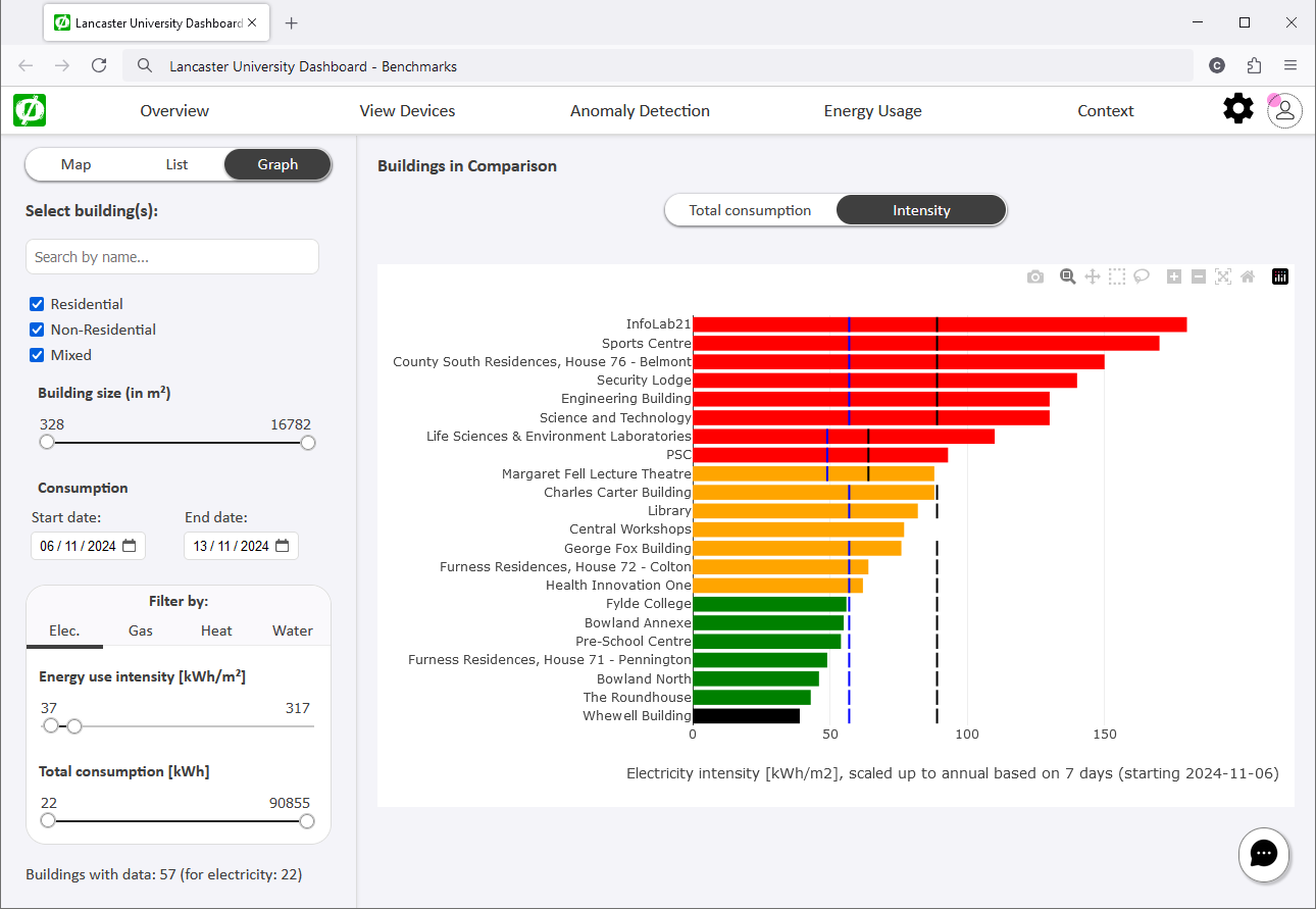
Energy management in corporate settings and public organisations is a complex subject that involves gathering, analysing, and interpreting vast amounts of energy data. Making such data accessible enables stakeholders to discuss potential savings, identify waste in consumption, and highlight opportunities for interventions. Our interactive dashboard takes historical energy data and displays it in different formats, enabling comparisons between buildings and to established industry benchmarks, and analyse abnormal and anomalous energy demand. Our dashboard can be enriched with contextual data, helping users explain why and when anomalies occur; for example, a unique event that resulted in higher-than-expected energy usage for a certain period in a specific building, or an intervention by the facility manager to save energy. Such context makes it easier for energy and building managers understand the sea of data in the context of complex building systems and their uses.
Detecting anomalies in energy and building data
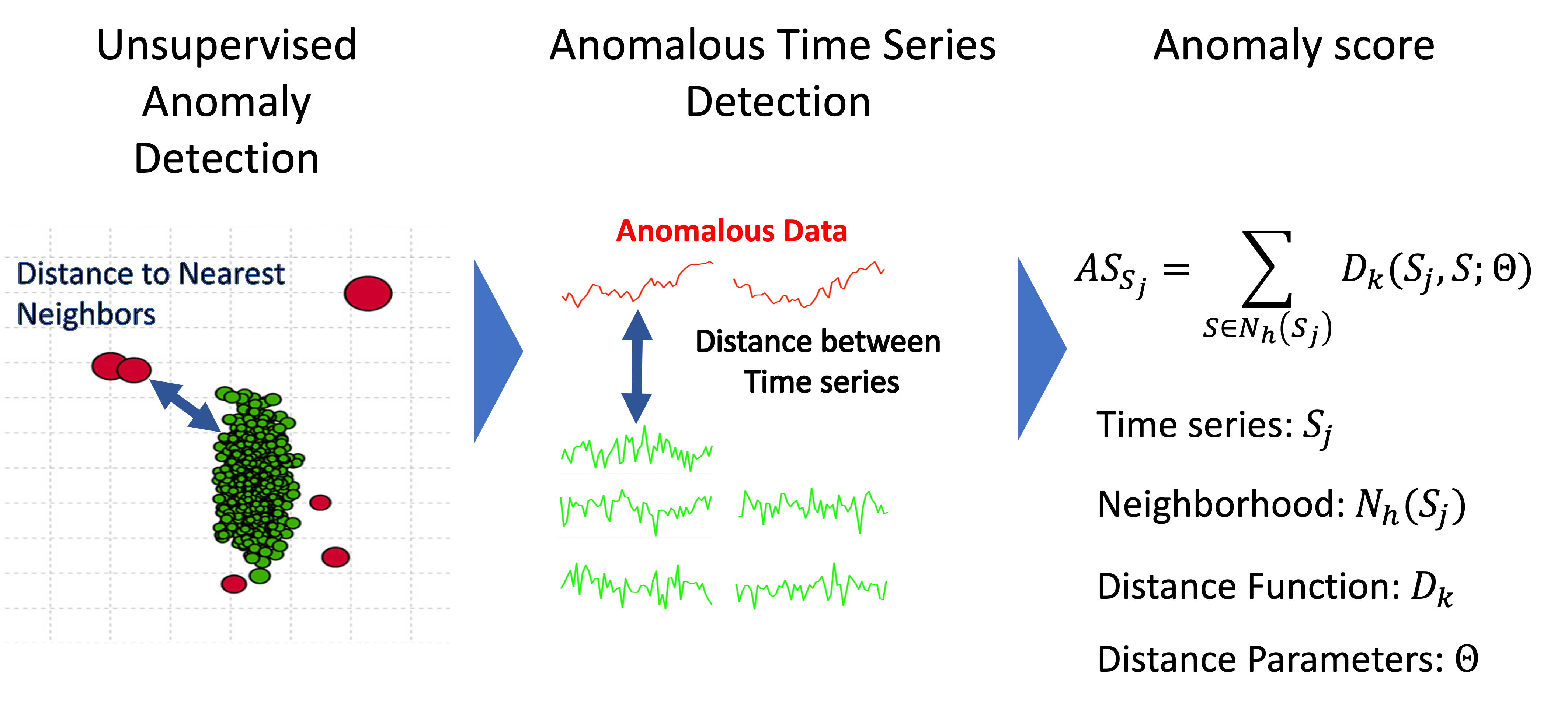 Energy consumption patterns in complex building settings are represented by multivariate time series for sources such as electricity, gas, water, or external temporal information on temperature, pollution, etc. With anomaly scores we can identify deviant usage patterns in complex building settings.AnomalyScore helps to compute anomaly scores for multivariate time series energy and building data.
Identifying abnormal behaviours through clustering energy usage
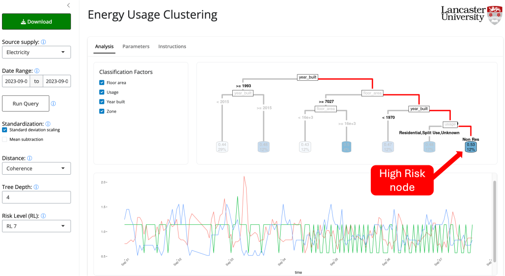 Understanding the usage patterns of buildings is key to developing energy management strategies. Complex building settings may display similar energy usage patterns for specific cycles, such as daily, weekly, monthly, and other periods like scholar terms. However, other building-specific factors might cause consumption patterns to differ according to internal activities such as research, teaching, catering, or administrative activities. The Energy Clustering Dashboard identifies abnormal behaviours in energy usage by comparing the energy usage patterns across buildings. The dashboard assigns an anomaly score to each building, indicating the potential of the consumption pattern being anomalous. Then, to understand the factors driving the building consumption, a regression tree clusters the buildings based on the anomaly score and other known characteristics.
Scoring anomalies in time series building and energy data
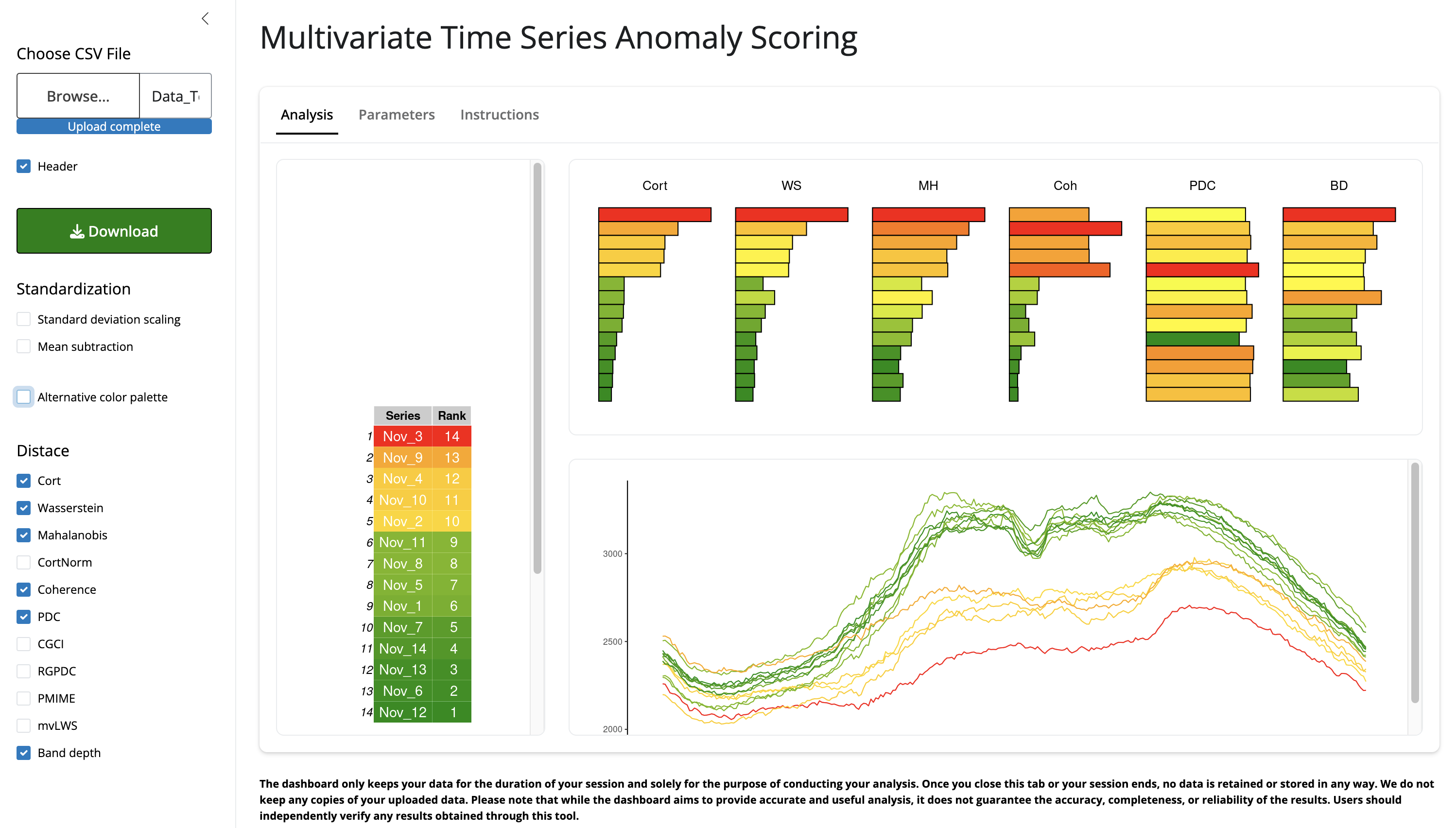
This dashboard allows public users to upload and explore anomalies in their data to benchmark multivariate time series via anomaly scores. This tools allows users to upload, explore visually, and rank multivariate time series data by assigning anomaly scores using a nearest-neighbor approach. The anomaly scores are computed using the R package AnomalyScore . Different options to compute the scores are provided to ensure a comprehensive analysis of the data.